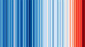
This image is a fantastic way to be able to see climate change. Created by Professor Ed Hawkins in 2018, it shows the changing in temperature over the last 2 centuries.
Blue lines show years where the yearly average temperature is lower than the overall average (and the darker the further below the average). The red is the opposite.
While it does not need pointing out, can you see how dark it has got in the last few years.
Below is a short video about the stripes with their creator explaining them.
